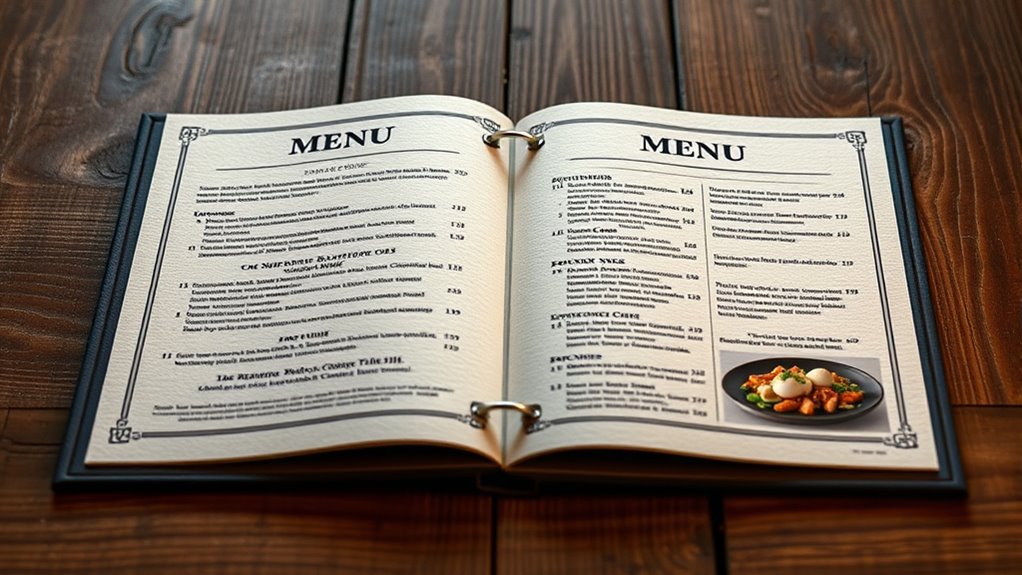

A well-designed menu uses visual hierarchy, font choices, and layout strategies to make your offerings clear and appealing. Highlight key dishes with larger fonts or bold text, and place them strategically to draw attention. Use easy-to-read fonts that match your restaurant’s vibe, and create a smooth flow that guides customers effortlessly through the options. By balancing these elements, you’ll help customers feel confident in their choices—exploring more is just a glance away if you keep going.
Key Takeaways
- Use clear, legible fonts that match the restaurant’s ambiance for easy reading.
- Implement visual hierarchy with larger, bold fonts to highlight popular or signature dishes.
- Organize menu sections logically with consistent font sizes and contrasting colors for clarity.
- Incorporate strategic placement and spacing to guide the customer’s eye smoothly across the menu.
- Highlight specials or profitable items using distinctive fonts or colors to draw attention effectively.
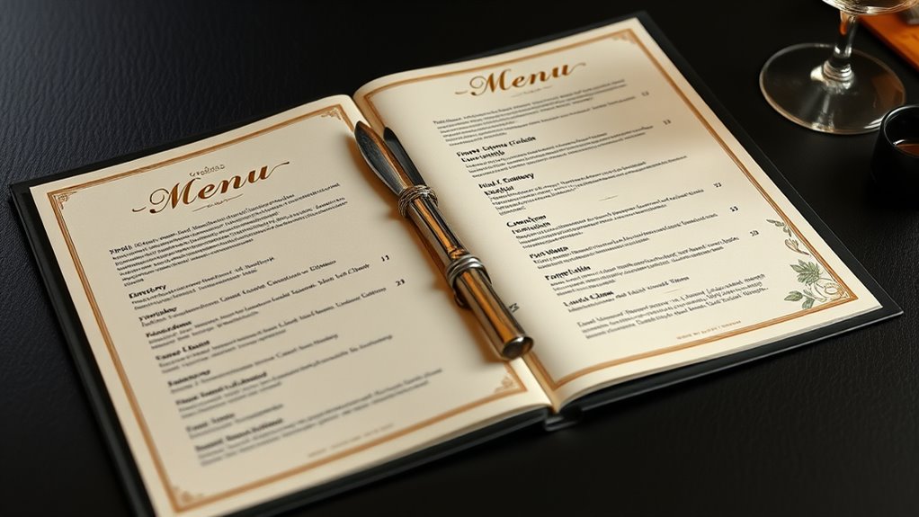
Have you ever wondered how a well-designed menu can influence your dining choices? It’s more than just listing food and drinks; it’s about guiding your eye smoothly from one item to the next, encouraging you to try new dishes or stick with favorites. This is where visual hierarchy plays a vital role. When a menu is thoughtfully organized, it naturally directs your attention to the most popular or profitable items first. For example, key dishes are often highlighted with larger fonts, bolding, or strategic placement, making it easy for you to spot them without much effort. This visual cue isn’t accidental; it’s carefully crafted to steer your choices subtly but effectively.
Alongside visual hierarchy, font selection greatly impacts how you perceive and process the menu. When the fonts are clear and appropriate for the style of the restaurant, they improve readability and create a cohesive look. For instance, a casual diner might use playful, relaxed fonts, while a fine dining establishment opts for elegant, refined typefaces. The right font selection ensures that you can quickly scan the menu without straining your eyes, making the ordering process smoother and more enjoyable. Conversely, cluttered or overly decorative fonts can confuse or discourage you, leading to frustration or hurried decisions.
Effective menu design balances these elements seamlessly. By combining strategic font choices with a well-thought-out visual hierarchy, the menu not only becomes easier to read but also more appealing. Clear headings, consistent font sizes, and contrasting colors help you differentiate sections and items effortlessly. Highlighting specials or signature dishes with distinctive fonts or colors draws your attention naturally, making it easier for you to consider them. When the layout feels intuitive, you’re more confident in your selections, which enhances your overall dining experience.
Frequently Asked Questions
How Does Menu Color Influence Customer Choices?
You notice that menu colors substantially influence your choices through color psychology and visual hierarchy. Bright, warm colors like red and yellow can stimulate appetite and draw attention to specific items, guiding you toward popular or profitable dishes. Cooler tones like blue create a calming effect, encouraging slower decision-making. By strategically using these colors, menus can subtly steer your selections, making the experience more engaging and increasing the likelihood of ordering certain items.
What Are the Latest Trends in Digital Menu Design?
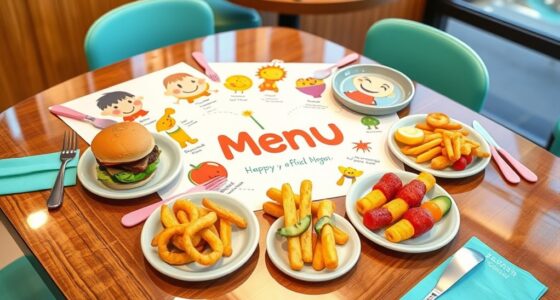
You should focus on incorporating interactive elements and visual storytelling in digital menu design. These trends engage customers more effectively, making their experience memorable. Use clickable images, videos, or animations to showcase dishes, and tell a story behind each item to create a connection. This approach not only boosts appeal but also guides choices intuitively, ensuring customers feel involved and excited about their selections.
How Can Menus Accommodate Dietary Restrictions Effectively?
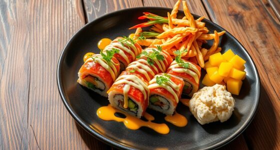
You can effectively accommodate dietary restrictions by clearly labeling vegan options and gluten-free items on your menu. For example, a restaurant increased customer satisfaction by adding distinct icons and detailed descriptions for these choices. This approach guarantees diners quickly identify suitable options, reducing confusion and enhancing their experience. Using consistent symbols and prominent placement makes dietary needs obvious, fostering inclusivity and encouraging repeat visits from health-conscious or allergy-sensitive customers.
What Role Does Font Style Play in Readability?
You should choose a clear font style that enhances readability, avoiding overly decorative fonts. Use proper font size and effective font pairing to make sure the menu is easy to scan. Larger sizes highlight headings, while smaller ones can list details, making the layout user-friendly. Consistent font choices help guide the eye smoothly across the menu, ensuring customers quickly find what they need without strain.
How Often Should Menu Layouts Be Redesigned for Freshness?
You should redesign your menu layout every 6 to 12 months to keep it fresh. Incorporate seasonal updates to highlight special items and reflect changing themes. Listen to customer feedback to identify what works and what doesn’t. Regular updates demonstrate you care about their experience, boost visual appeal, and keep your offerings exciting. This approach maintains engagement and ensures your menu remains appealing and easy to navigate.
Conclusion
Remember, your menu is the welcoming handshake that invites diners in. When you craft it with clarity and style, it becomes a magnetic force, guiding their eyes and appetites effortlessly. Think of your menu as a well-orchestrated symphony—each element harmonizing to create an irresistible melody. A thoughtfully designed layout lights the way like a lighthouse, steering customers straight to your culinary treasures. With attention to readability and appeal, you’ll turn every visit into a memorable journey.