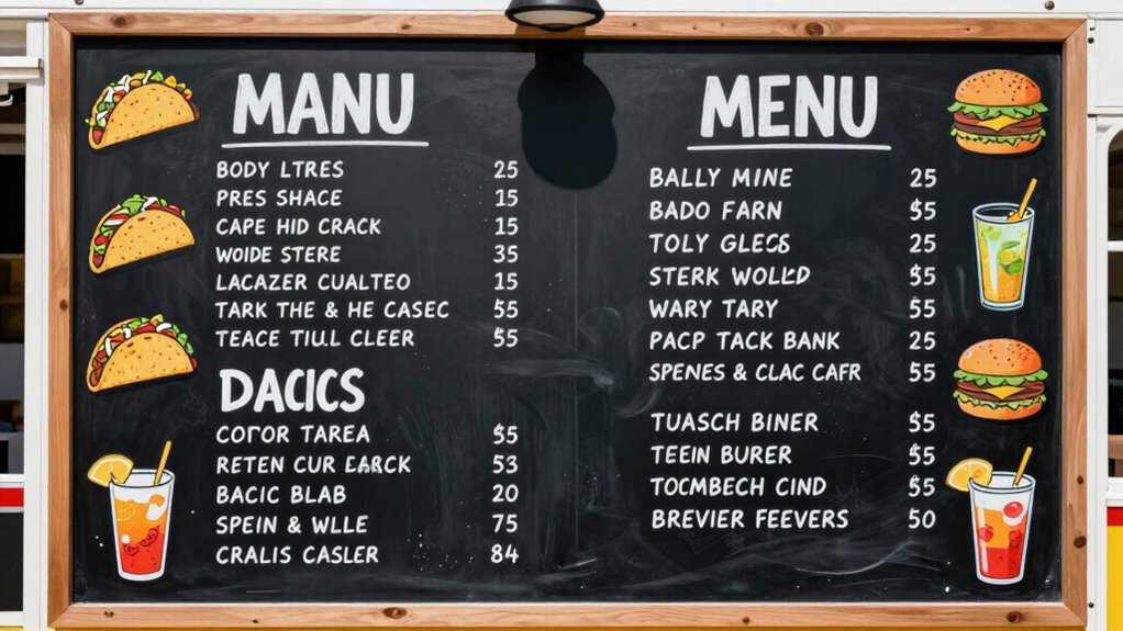

To make your food truck menu easier to read at a glance, focus on creating a clear visual hierarchy with size, color, and placement to highlight popular or profitable items. Organize sections logically with distinct divisions, using icons or images for quick recognition. Choose simple, legible fonts with high contrast to improve readability, especially outdoors. Keep text concise and uncluttered, guiding customers smoothly through their choices. Keep exploring to discover more tips for a standout menu.
Key Takeaways
- Use clear, large, and bold fonts for headings and key items to ensure quick visibility.
- Organize menu sections logically with distinct divisions and ample spacing.
- Incorporate high contrast between text and background for outdoor readability.
- Highlight popular or profitable dishes with size, color, or visual cues.
- Keep descriptions concise and limit text to facilitate rapid scanning.
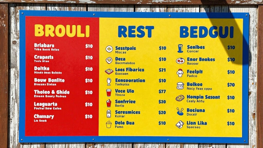
A well-designed food truck menu can make all the difference in attracting customers and boosting sales. When people walk up to your truck, they want to quickly understand what you offer without feeling overwhelmed. That’s where effective design principles come into play, especially visual hierarchy and font selection. These elements work together to guide the eye naturally across your menu, highlighting the most important items and making the entire list easy to scan.
Visual hierarchy is essential because it determines what customers notice first. You want your most popular or profitable items to stand out immediately. Use size, color, and placement strategically—large, bold fonts for headings or signature dishes draw attention. Group related items together with clear divisions or spacing, making it easier for customers to navigate. For example, appetizers, mains, and desserts should each have distinct sections, so people can find what they want without searching. When the hierarchy is logical and uncluttered, customers can process the menu faster, leading to quicker decisions and happier experiences. Paying attention to menu organization can further enhance this clarity. Additionally, incorporating visual cues like icons or images can help communicate the offerings more effectively. Proper menu layout also plays a crucial role in guiding the customer’s eye smoothly across the menu.
Prioritize key items with size, color, and clear sections for quick, easy customer navigation.
Font selection is equally important and directly influences readability. Choose fonts that are clear and legible from a distance. Avoid overly decorative or script fonts that might look appealing but are hard to read quickly. Instead, opt for simple, clean fonts like sans-serif styles, which maintain clarity even in low-light or outdoor conditions. Consistency in font usage helps reinforce the hierarchy—use one or two fonts at most, with variations in weight or size to indicate importance. For example, a bold font for item names and a lighter font for descriptions create contrast without cluttering the layout. Remember, the goal is to make every word easy to read at a glance, so don’t sacrifice clarity for style.
In addition, consider the contrast between text and background colors. High contrast ensures readability from afar, especially in bright daylight. Keep your menu uncluttered by limiting the amount of text and avoiding excessive embellishments. Use bullet points or short descriptions to keep information concise. Incorporating consistent font styles can help maintain a clean and organized look. When your visual hierarchy is clear, and your font choices are deliberate, customers can quickly scan your menu, decide what to order, and move on smoothly. This not only improves their experience but also increases your chances of making sales. A thoughtfully designed menu isn’t just about aesthetics; it’s about making your food truck approachable, professional, and easy to navigate.
As an affiliate, we earn on qualifying purchases.
Frequently Asked Questions
How Does Font Size Impact Menu Readability?
You’ll notice that larger font size greatly improves menu readability because it enhances text contrast and makes key items stand out. When you use varied text hierarchy, bigger fonts for headings and smaller for descriptions guide your customers’ eyes naturally. This combination helps people quickly scan your menu, reducing confusion and making their ordering process smoother. Clear, legible fonts ensure everyone can effortlessly find what they want, boosting overall satisfaction.
What Colors Are Best for Menu Visibility?
Bright, contrasting colors like black on yellow or white on red boost menu visibility because they catch the eye quickly. Using color psychology, you can evoke specific feelings—warm hues like red and orange stimulate appetite, while cool shades like blue create calmness. Incorporate these colors into your visual branding to make your menu more eye-catching and easy to read at a glance, helping customers quickly find what they want.
Should Menus Include Images or Just Text?
Think of your menu as a vibrant photo album; including well-chosen images can entice customers, but too many may clutter the view. Use menu photography sparingly to highlight signature dishes, and pair it with clear, legible font styles. This balance helps customers quickly identify options without overwhelming them. Keep text concise, and let images complement rather than dominate, guiding their eyes effortlessly through your menu.
How Can Menu Layout Reduce Customer Confusion?
You can reduce customer confusion through clear menu layout by prioritizing pricing clarity and menu organization. Use logical sections, like appetizers, mains, and desserts, and keep similar items grouped. Highlight prices and special offers to avoid ambiguity. Simple fonts, consistent formatting, and ample spacing make the menu easy to scan quickly. This approach helps customers find what they want efficiently, enhancing their overall experience and speeding up decision-making.
What Is the Ideal Menu Item Description Length?
Think of your menu as a clear window into your offerings—short and sweet descriptions are your best tools. Keep each item description around 2-3 lines, ensuring ingredient clarity and pricing transparency shine through. This length prevents overwhelm, helps customers make quick decisions, and builds trust. Use simple language and highlight key ingredients, making it easy for customers to understand what they’re ordering without sifting through a sea of text.
As an affiliate, we earn on qualifying purchases.
Conclusion
Making your food truck menu easy to read isn’t just about aesthetics—it directly impacts sales. Clear, organized menus boost customer satisfaction and can increase orders by up to 20%. Remember, using legible fonts, logical categories, and highlighting popular items helps customers make quick decisions. By simplifying your menu, you create a smoother experience that keeps them coming back. So, invest in readability—you’ll see the positive difference in your business’s success.
menu icon stickers for food trucks
As an affiliate, we earn on qualifying purchases.
As an affiliate, we earn on qualifying purchases.
high contrast outdoor menu cards
As an affiliate, we earn on qualifying purchases.
As an affiliate, we earn on qualifying purchases.